The dataset I used can be found here and contains data on the lives of artists’ lives- each row corresponds to an artist and contains the dates places of their birth and death, and a link to a webpage with more info on the artist and their work.
The bulk of my work involved cleaning the data- I used openRefine and excel to do so. First, I needed to separate the dates column into two columns- one for the birth date, and one for the death date. For example, a dates entry 1945-1991 was changed to two separate columns, one containing the birth year 1945, and the other containing the death year 1991.
Next, I cleaned up the birth and death city/country data. Many of the cities and countries were written in their native language. For example, Italy was written as Italia, Sweden was written as Sverige, Japan was written as Nihon. I converted all of the Country names to their English translation so that they would be more easily viewed in a visualization.
For my visualization, I chose to focus on the relationship between the birth countries and death countries. Where did most artists die? Are there any trends? My last step in data cleaning was to remove data from countries that had less than 6 entries so as to make the visualizations more easily readable. Figure 1 shows my visualization for this process.
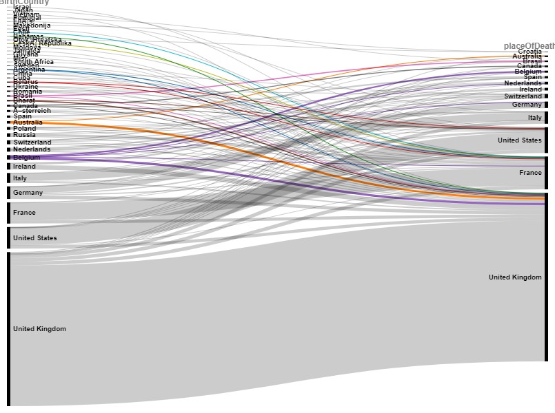
I used Raw Graphs 2.0 to upload my downloadable .pdf from openRefine and use their visualization tools to present the birth-death country relationship in the form of an Alluvial Diagram.
The diagram suggests that there is a trend in artists dying in the UK. Perhaps the UK sucks the life out of artists? This may be a result of the art scene being most prominent in the UK so artists travel there and spend the rest of their lives there. Of course more investigation would need to follow before any concrete conclusions are made, but this type of visualization can guide a hypothesis that would lead to additional research on the topic.
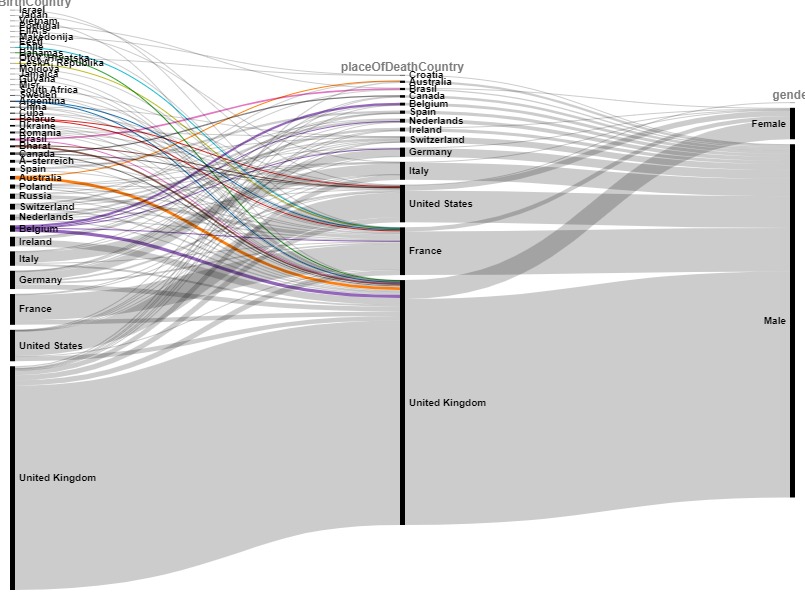
After examining trends between the birth and death countries, I wanted to see how the gender of the artists contributed by adding another step in the Alluvial diagram as pictured in Figure 2. This data is harder to interpret, but it shows the power of an Alluvial diagram- it enables you to add as many steps so see the flow in data which could be useful.
